Gimp: Pixel Art Character
Objectives and Overview
Pixel art was done out of necessity in the early console games but has recently surged in popularity in the indie game community, partly due to the success of Minecraft. Pixel art is lots of fun to create, and you’ll be developing pixel art characters that you’ll use when you start the Game Development With Scratch module.
This is a fun way to practice navigating Gimp and developing a graphic design workflow. The skills that you’ll use in this project translate directly to Adobe Photoshop, one of the pillars of professional graphic design. Pixel art pairs very well with 2d games, especially platformers. This lesson will walk you through the basics, but the main goal is to get you exploring and creating so that you’ll refine your Gimp skills along the way!
Lesson Objectives
- Practice navigating in Gimp
- Demonstrate that you can create pixel art with Gimp
- Become familiar with pixel art techniques, such as shading and dithering
- Develop an eye for working with color and color palettes
- Create a pixel art character and other assets for your game
Creating Pixel Art
One of the key distinctions of pixel art from vector art is that pixel art is created with raster graphic software. Pixel art can be created with any software that allows for the creation of squares in a zoomed in the grid, but Gimp has a faster workflow because it allows for setting the pencil to a pixel, enabling the user to paint with pixels.
Many professional pixel artists use Photoshop to create their art, and the skills that you practice while creating art with Gimp will transfer to Photoshop if you decide to pursue that in the future.
Getting Started With Gimp
Launching Gimp
Click on the magnifying glass at the top right of your desktop and search for “Gimp.” This will locate the file. Go ahead and click on it to launch Gimp! Alternatively, you can use the Launchpad to start the software. Launchpad is the rocket ship icon on the Dock that you used to launch Inkscape.
You should have Gimp pre-installed, but in case you don’t here is the download link: Gimp Download. Navigate to that page and click Download Gimp 2.8.16 directly. The download is a .dmg file which you can open once it finishes.
As a supplement to the in-class demo, here is a video that will walk you through how to set up your Gimp workplane and save your creation.
Activity: Create a Sprite
Now that you have an understanding of pixel art it’s time to get creating! Pixel art is fun and there is quite a lot of room for creativity and complexity. This activity is a chance for you to get some practice with Gimp before you start creating sprites for a Scratch game. Create a graphic prop (i.e. a coin or tree).
Helpful Presets for Pixel Art
One great feature in Gimp is the ability to set presets for your tools. Here are some helpful presets for you to reference:
- New Project Image Settings:

- Zoomed in Workplane:

- Pencil Preset:

- Eraser Preset:

Sizing for Pixel Art
Generally, you’ll want your pixel art to be done in powers of 2, such as 16x16px, 32x32px, and 64x64px. For the backdrops, it’s recommended that you use the size of the Scratch screen, 480x360px. This way you’ll know that what you’re making will correctly correspond to the Scratch screen size.
Color and Shading Techniques for Pixel Art
One of the most interesting and creative aspects of pixel art is the use of limited colors to create shades and textures in the pieces. There are some different techniques on it, and you should do some google or YouTube searches if you’re looking for more instruction. However, here are some basics to get you started:

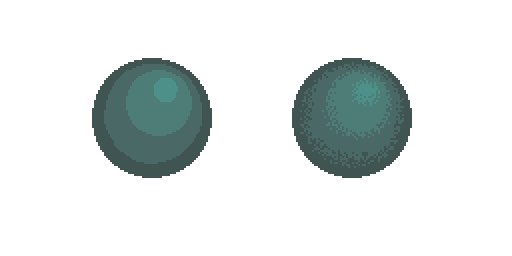
Dithering is a technique employed by several pixel artists in shading and blending colors. Here is a great comparison of a non-dithered and a dithered sphere, courtesy of
a Pixel Art in Photoshop blog post by Indium Games:
The same principles used in Photoshop apply to Gimp, so if you’re finding examples for Photoshop you can almost always apply those principles to Gimp as well.
Link for more detail: Dithering Blog Post from Indium Games.
Dithering is used more often in larger pieces such as backdrops as opposed to smaller pieces like characters and objects. Dithering helps create transitions between colors and enables complex shading and blending to be done with a rather limited color palette. If you’re going to be using a limited palette such as the original NES color set that is linked below in the resources, you’ll likely want to experiment with dithering. It takes a lot of practice before honing your style. There’s several resources out there specifically about dithering, so if you’re interested in developing this skill do some searches on YouTube or Google!
Traditional shading techniques are also employed by artists. Shading in pixel art provides a lot of the charm associated with it and it is highly recognizable. Consider this pixel heart created by tomred12 at piq.codeus.net as an example:

While the shading isn’t necessary, it contributes to the immediately recognizable style associated with pixel art.
Further Skill Development
Here is a great resource with examples. It is highly recommended you look through this guide:
Pixel Shading Tutorial by Kitted It is a large image. I would recommend opening it in another tab and zooming in for the instructions and examples.
Here are two more links about light and shading. They aren’t specifically for pixel art but are excellent resources if you’re interested in understanding more about the relationship between light sources and shading. These concepts can be applied to your pixel art.
Additional Shading Resources:
Color choice is another important aspect of pixel art creation. Early video games for the Atari, Commodore 64, and Nintendo had limited color palettes available for their sprites and backgrounds. As a result, pixel artists had to be highly creative with their color usage. If you’re interested in obtaining a truly retro feel to your game while simultaneously working within the same color constraints that the early designers did, you should restrict your color choice to the original palette available for the NES!
If not, consider using things like black borders around your characters to help them stand out against the backdrops. Additionally, consider using black to draw attention to certain key characteristics of your sprites, such as the eyes, mouth, or character outline.
You can also use contrast to highlight key aspects of your characters. For example, if you have a character with mostly dark coloring, adding even a single light colored pixel can drastically alter the appearance, such as in the heart example above.
Things to Consider:
Pixel art is a fun way to develop having an eye for color, which is a key element of graphic design. There are some key ways you can practice this skill, such as working with a set color palette for your character art.
Another way that making pixel art fits into graphic design is that you’ll begin to develop an eye for how small color changes can have a large impact on your project. Paying attention to these subtle changes will further develop your eye for color and design.
Here are some great resource for working with color/color palettes:
- Adobe Kuler
- Color Hex: Contains colors and their hex values.
- Colour Lovers